Friday, April 23, 2010
Thursday, April 22, 2010
Thursday, April 1, 2010
Project 3: Candance & Liset
The team of Liset and Candace met this morning and we decided on the paper samples option. We both love paper and were attracted to the possibilities of creating dimension in our book. Some of the images we were inspired by came from paper sculptors. We divided our next few days into research – Liset will look at imagery and Candace will go to art supply stores to get an idea of the scope of our sample book.
Here are some of the images that inspired us.
Inspiration:
Tuesday, March 23, 2010
Software: Rough Digital 1 of 2
I am not completely happy with the designs. So as of right now, I am re-evaluating my layout. I just know I want to keep the same idea, but tweak the layout.
Monday, March 15, 2010
Tuesday, March 9, 2010
Computer Software

What caught my eye was the bold packaging, it stood apart from all the other software in the counter. For one, it uses a splash of color to define the look and feel. All other products seemed dull to me, when placed next to it.
The majority where white backgrounds with a lot of type. By contrast, the images used here are great. It gives a clean, vibrant, sophisticated, advanced and professional look to the software. The series work well together, they are unified through images, type and placement. I really like the design, especially of the second set.
As a series, I think the packaging works well. The layout is simple: One image, with a specific color and form accompanied by text. The hierarchy is clear. My attention is caught by the vivid (almost neon-like) colors and moves on to the headline and travels on to see the general information.
Overall the software is well designed, but I believe there is potential for improvement. There always is. Perhaps making it more corporate looking, have a sleeker aesthetic, im not sure but there is definately a lot of possibilities with this package.
(to be continued)....
In the mean time, here are some other packaging samples by Panda Security:


Saturday, February 27, 2010
Wednesday, February 24, 2010
Monday, February 22, 2010
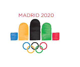
latest olympic logo.
I made some changes to the design.
I added brush stokes within the forms,
The rings are significantly smaller.
The "Madrid 2020" headline is red, and placed above the icon.
Hope its an improved design. :)
Monday, February 15, 2010
Tuesday, February 9, 2010
Wednesday, February 3, 2010
Thursday, January 28, 2010
Friday, January 22, 2010
Olympic Summer Games 2020!
Madrid, Espana!!!

I chose Madrid for its richness in culture and history. It is home to the most beautiful architecture I have ever seen. It is a city that embraces its past and maintains a historic quality, that unfortunately is not seen in many cities of today. Beyond this, Madrid is a captivating place full of life, music, art, movement and above all heri
tage. It has plenty to offer in every respect. It is the perfect city for the Olympic Games of 2020.

Motto: "On water I was built, my walls are made of
fire."
Population: 3million+
-One of the wealthiest cities of southwest Europe.
-Political center of Spain.
- Home to the Spanish monarch.
Historical Landmarks include:
Royal Palace of Madrid: Official home to the King of Spain. Largest palace of Europe.


Calle de Alcala: Oldest and longest street of Madrid.

Plaza de Cibeles: home to marble structures. Built in 1770's.
Icon of Madrid.
Focal point is the fountain of Cibeles, goddess of fertility.

Plaza de Toros de Las Ventas: famous bullring. Built in
1931.Hosts bullfights during the San Isidro Fiestas.One of the largest bullrings in the country.

Attributes include the fine artists which have come from Spain:
-Including Miguel De Cervantes, who wrote "Don Quixote," one of the most famous (and entertaining!) novels ever written.

-Francisco Goya: to many he is seen as the "Father of Modern Art." Developed a new way to express oneself through paint. Rejected ideals of art, which came before him. Below "3rd of May," painted in 1808. His work is housed in the museum, El Padro. It is also home to works by Diego Velazquez.

Wednesday, January 20, 2010
What inspires me...
I chose Graphic design as my career because I've always loved everything about art. It involves creativity, color, technology, design and imagination. I love the idea of being able to create amazing pieces out of images, forms and color. Graphic design is open to anything, its great! I see it less as a job, and more as an outlet to be able to express myself. Design is everywhere, I find it very intriguing yet entertaining at the same time. I want to be apart of the design world and be able to create pieces that can one day be seen in magazines, billboards and so on. My favorite designs are logos and webpages. Both because of their simplicity and functionality. Overall, Graphic Design is what I love to do. =0)
Subscribe to:
Posts (Atom)


